To give your team just the components they need while keeping the UI intentional and specific to your needs, use components-only mode. With components-only mode, you can customize your team's collection of components to only the components you provide.
You can implement components-only mode at both the organizational or model level to help your team stay true to your design standards.
To use components-only mode, you should be familiar with:
Components-only mode is an account-wide setting with toggles that affect all users in the same way. If you'd like to apply components-only mode to all of your users, go to the next section, Turning on components-only mode in Account Settings. If, instead, you'd like to specify access per user, you can use Roles and Permissions, as this section describes.
By assigning Editor permissions to particular users, you give them the ability to create content but they can't edit styles, which helps keep the design consistent. This is similar to components-only mode in that users have access only to what they need.
In this way, other users, such as designers can still make Templates and Symbols for Editors to use independent of the developer release cycle.
To apply the role of Editor to a user, do the following:
- Go to Account Settings.
- In the Users section, click on the user to edit permissions.
- Choose Editor.
- Click the Update button.
For more information on specifying access, refer to Roles and Permissions.
If you want to globally ensure that all users use only the components you provide, turn on components-only mode in Account Settings for the Space. This setting applies to all users.
Editing this setting requires Admin or Developer permissions.
The following video shows you where to find the components-only mode in Account Settings and demonstrates toggling the three settings within the components-only dialogue. Though the video switches all three to the off position, you can set them independent of one another for varying degrees of access.
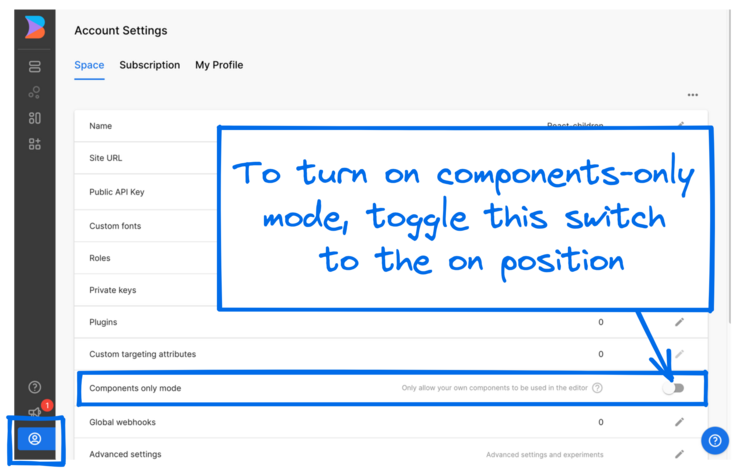
To turn on components-only mode in Account Settings, follow these steps:
- Go to Account Settings
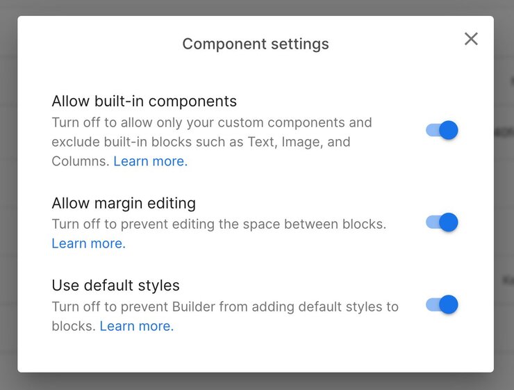
- On the row that reads Components-only mode, click the toggle to the on position. When you toggle to the on position, a dialogue opens with three settings.

You can toggle Builder's built-in blocks, decide whether users can edit margins, and if default styles apply. The next section explains each toggle in detail.

If you leave all three on, Builder removes the Style tab from the Visual Editor, but users can still drag in built-in blocks and adjust margins.
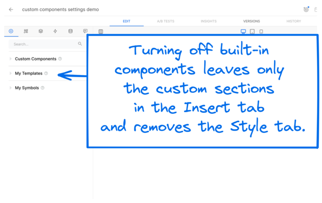
The default for Allow built-in components is on, which permits the default blocks in Builder to be in the Insert tab. By toggling this setting to off, you remove all of the built-in blocks that come with Builder from the Insert tab. Changing this setting to off also removes the Style tab entirely so you can control styles from your code.
Users can still edit margins by dragging the margin dot on the block.
This toggle is useful if you want teammates to only use your custom components.

When you toggle Allow built-in components to off, only Custom Components, My Templates, and My Symbols remain in the Insert tab, as in the following image:


Users can edit block margins by default. When you turn off this feature, users can't edit margins on blocks by dragging the margin dot, which no longer displays. Changing this setting to off also removes the Style tab entirely so you can control styles from your code. This setting is useful for maintaining consistent spacing in your layouts.
Turning this setting off prevents Builder from adding default styles to blocks. Changing this setting to off removes the Style tab entirely so you can control styles from your code; however, users can still adjust margins by dragging the margin dot on a block.
To experiment with components-only mode, check out an example custom design system in React on GitHub.
Looking to hire a third party to help with your project?
Submit a project request and our partnerships team will reach out to connect you with an Expert from our partner ecosystem.

© 2020 Builder.io, Inc.


