

Design Systems
5 biggest daisyUI anti-patterns (and how to avoid them)


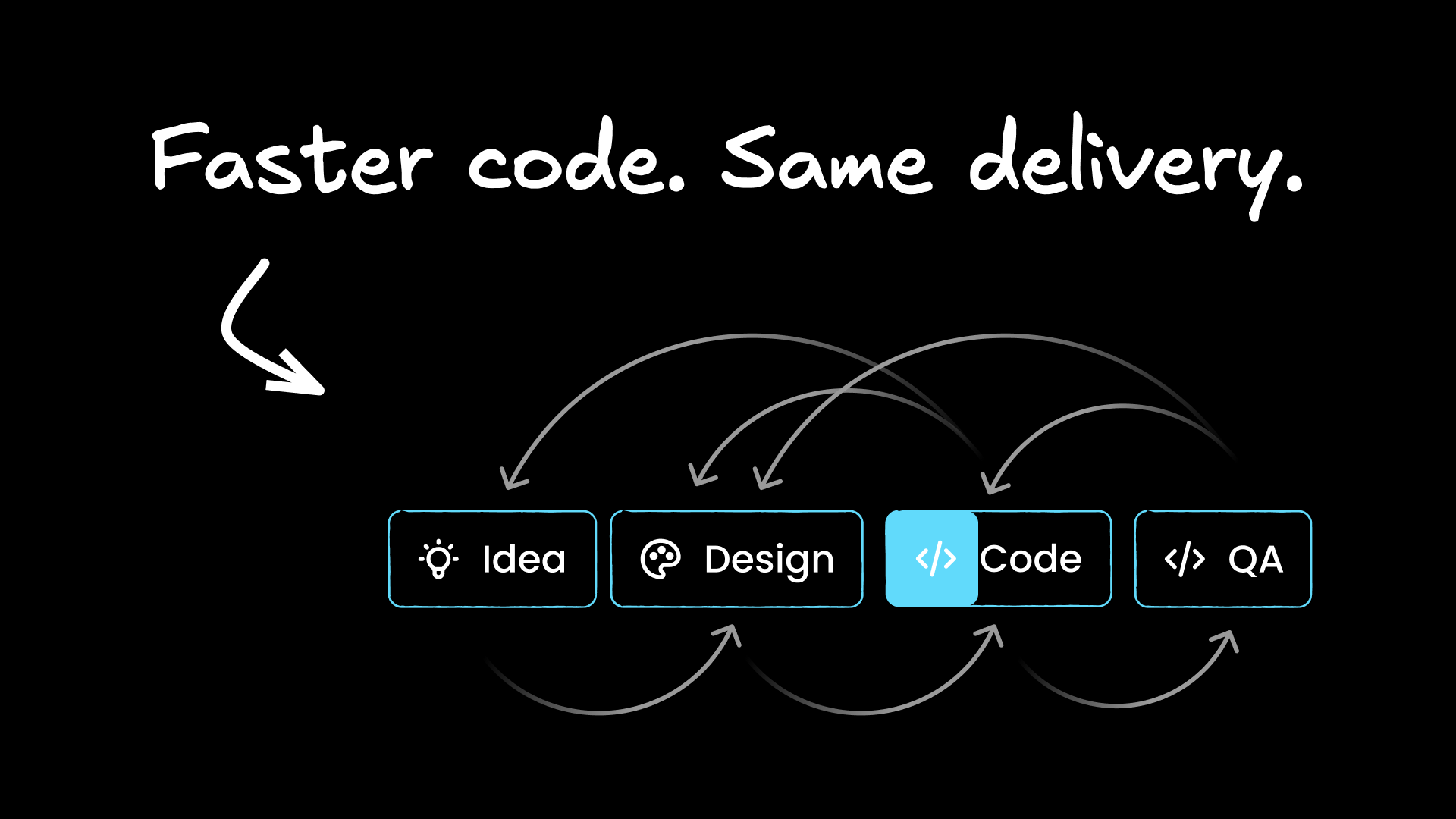
daisyUI promises to accelerate web development with pre-built components and semantic utility classes, but teams often encounter critical roadblocks that derail projects. These implementation challenges affect everything from component customization to code readability, turning what should be a productivity boost into a source of frustration.
This complete troubleshooting guide addresses the most common anti-patterns and persistent problems developers face when building applications with daisyUI. You'll get proven solutions for customization conflicts, responsive design complexity, theme implementation issues, component patterns, and code consistency problems.
You’ll also learn how AI tools like Fusion can automate these solutions entirely.
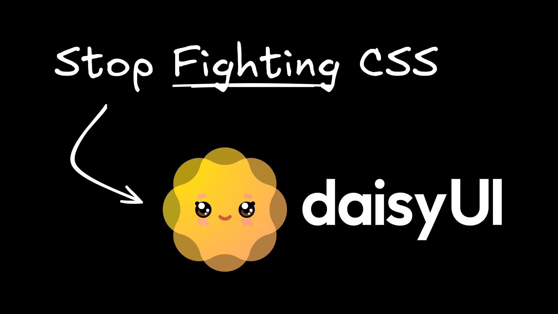
daisyUI: the best semantic CSS framework
daisyUI transforms how developers write TailwindCSS by replacing verbose utility combinations with semantic, readable class names. Their approach eliminates the "utility soup" problem while maintaining Tailwind CSS's underlying power and flexibility. This semantic naming convention makes components instantly recognizable and easier to maintain than traditional utility-first approaches.
This semantic approach brings massive benefits to development teams. Your components become self-documenting. A card is obviously a card. A btn-primary is clearly a primary button. New team members can read your HTML or JSX and immediately understand the component hierarchy without decoding utility class combinations.
daisyUI's theming system also provides 30+ pre-built color schemes, from professional themes like "corporate" and "business" to playful options like "cupcake" and "synthwave." These themes work consistently across all components, so switching from light to dark mode or rebranding your entire application becomes a single configuration change rather than a CSS overhaul project.
For instance, I used Fusion to build this interactive demo for all 32 official daisyUI themes. It only took a few minutes:
1. Manually converting designs into daisyUI
Despite daisyUI's semantic benefits, you're still responsible for mapping your designer's visual language to the component system's semantic structure. Converting Figma designs into proper components is usually a time-consuming and manual process.
This design-to-code gap slows every project iteration. A simple button design requires analyzing colors, sizing, states, and spacing to determine whether it should be btn-primary, btn-secondary, or a custom variant. Complex layouts with mixed component types can become time-consuming puzzles of semantic class selection and responsive utility combinations.
Common mistakes
- Manual Visual Analysis requires examining every design element and making component mapping decisions.
- Trial-and-Error Implementation involves building components, comparing results, and adjusting until designs match.
- Design System Misalignment occurs when Figma components don't correspond to daisyUI's semantic structure, forcing custom solutions.
Best practices
Establish clear component mapping conventions between your design system and semantic classes. Create a shared library that documents which Figma components map to which implementations, including reasoning for class selection choices.
Use consistent naming between design and code. If your Figma design system has "Primary Button" and "Secondary Button," ensure your implementation uses btn-primary and btn-secondary.
Convert Figma designs to daisyUI components using AI
Fusion AI and its best-in-class Figma plugin analyze your designs and generate optimal daisyUI class combinations in seconds. Together, they understand visual hierarchy and semantic meaning, creating clean code that matches designs exactly while following best practices.
Fusion eliminates the manual translation step entirely, converting Figma designs into daisyUI components with built-in responsive behavior and accessibility standards.
2. Building inconsistent component architectures
daisyUI provides some great building blocks, but component composition patterns aren't obvious. Should you nest a card inside a hero? How do you combine form components with validation states?
Complex layouts like dashboards require decisions about HTML structure, padding responsibilities, and accessibility considerations. These architectural choices create precedents affecting your entire codebase.
Common mistakes
- Trial and Error creates inconsistent patterns.
- Copy-Paste Solutions lead to code duplication without understanding.
- Custom Wrapper Components can break intended usage patterns.
Best practices
- Follow daisyUI's component hierarchy and nesting guidelines. The framework has opinions about how components should work together, and respecting those patterns makes your code more predictable and maintainable.
- Create consistent composition patterns for common use cases. Be wary of wrapper components. Document your component composition decisions so team members understand the reasoning behind architectural choices.
Build complex daisyUI components with AI
Fusion understands your architecture and generates proper composition patterns. It builds complex UI features like charts and graphs using smaller daisyUI components and following best practices.
3. Overriding daisyUI’s pre-built components
You need a button that's almost like daisyUI's btn-primary, but with custom colors and styling. This scenario affects most real-world projects where designs don't exactly match the framework’s defaults.
Your options are problematic: CSS overrides create specificity wars and maintenance nightmares. Custom components break theme consistency and require separate state management. Mixing utility classes leads to bloated HTML and unclear component boundaries.
Common mistakes
- CSS Overrides require
!importantdeclarations and break with framework updates. - Custom Components don't respond to theme changes and require separate state maintenance.
- Utility Class Mixing creates bloated HTML with unclear component boundaries.
Best practices
The key is working with daisyUI's systems rather than against them. Use CSS custom properties for brand-specific customization that respects the framework's architecture. Instead of overriding btn-primary, create a new semantic color for your theme configuration.
Create component variants using the official modifier system. If you need a "soft" button variant, define it as a proper theme extension rather than a collection of utility overrides.
AI-powered solutions
Fusion’s unique visual development platform analyzes your design requirements and generates optimal daisyUI class combinations. It understands when to use theme customization versus utility combinations, maintaining design system consistency while achieving exact visual requirements.
Even better, Fusion's native integration with the Context7 MCP server provides real-time access to current developer documentation, ensuring generated code follows the latest framework conventions and best practices.
4. Hand-rolling responsiveness
Since daisyUI uses Tailwind CSS for responsive behavior, HTML can become cluttered with responsive utility classes. Managing breakpoint combinations across multiple components becomes complex when design requirements change.
A product grid showing different columns per breakpoint requires classes like grid-cols-1 md:grid-cols-2 lg:grid-cols-4. This pattern, repeated across dozens of layouts, creates maintenance overhead when designers request changes such as "show 3 columns on tablet instead of 2."
Common mistakes
- Manual Responsive Classes create HTML bloat and unreadable markup.
- Custom Media Queries break the utility-first philosophy.
- JavaScript-Based Solutions add complexity and SSR hydration issues.
Best practices
- Plan mobile-first with progressive enhancement. Start with the mobile layout as your base, then add responsive prefixes only where the layout actually changes. Use Tailwind's responsive prefix system consistently across your team—this applies to both daisyUI component modifiers and standard Tailwind utilities.
- Create reusable responsive component patterns. Instead of repeating
grid-cols-1 md:grid-cols-2 lg:grid-cols-4throughout your application, create semantic component classes that encapsulate your responsive behavior. Read more about Tailwind's responsive design.
Building responsive daisyUI components with AI
Fusion automatically generates optimal responsive utility combinations. It writes clean frontend code with minimal responsive classes and ensures consistent breakpoint behavior across layouts. Learn more about AI-powered React development workflows that extend these capabilities.
5. Manually configuring new themes
DaisyUI's theming system requires understanding CSS custom properties and semantic naming. You need to map brand colors to daisyUI's variables like --p (primary) and --s (secondary) while maintaining proper contrast ratios and accessibility.
Dark mode and multi-tenant applications add complexity. Each theme needs consistent behavior across all components without flash-of-unstyled-content issues.
Common mistakes
- Manual Theme Configuration is time-intensive and error-prone with complex contrast requirements.
- CSS Variable Overrides require deep framework knowledge.
- Multiple Theme Files create maintenance overhead and bundle bloat.
Best practices
- Use daisyUI's semantic color system as the foundation rather than working around it. Map your brand colors to semantic meanings rather than trying to preserve exact hex values everywhere.
- Use the 30+ built-in themes instead. They’re good.
- Test theme combinations for accessibility and contrast compliance using automated tools. Learn more about daisyUI themes.
- Implement proper CSS custom property scoping so theme switching doesn't cause layout shifts or performance issues.
- Consider using the theme-change library for smooth theme switching.
Creating new themes with AI
Fusion AI extracts design tokens from Figma files and generates complete theme configurations with proper contrast ratios and accessibility compliance across light and dark themes.
Skip the UI headaches
These five daisyUI problems don't have to slow down your next project. While you can implement manual fixes for converting Figma designs, setting up theme configurations, documenting component patterns, and creating responsive utilities, there's a faster path forward.
Fusion eliminates the entire design-to-development handoff. Upload your Figma designs and get production-ready daisyUI components in seconds, complete with proper semantic classes and responsive behavior built in.
To learn more about Fusion, check out:
Frequently Asked Questions About daisyUI Best Practices and Anti-Patterns
What is daisyUI and how does it differ from plain TailwindCSS?
daisyUI is a component library built on top of TailwindCSS that replaces verbose utility class combinations with semantic, readable class names. Instead of writing a long chain of utility classes to style a button, you write btn btn-primary. Components become self-documenting — a card is obviously a card, a btn-secondary is clearly a secondary button. It also includes 30+ pre-built themes that work consistently across all components, so switching between light and dark mode or rebranding an application becomes a single configuration change.
What is the most common daisyUI anti-pattern teams run into?
Manually converting Figma designs into daisyUI components. Every design element requires analysis to determine the right semantic class — whether something should be btn-primary, btn-secondary, or a custom variant. Complex layouts compound this into time-consuming trial-and-error work. The fix is establishing clear, documented component mapping conventions between your design system and daisyUI's semantic structure, so the whole team makes consistent decisions rather than each developer guessing independently.
How should you customize daisyUI components without breaking theme consistency?
Work with daisyUI's systems rather than against them. Instead of overriding btn-primary with CSS that requires !important declarations and breaks on framework updates, define customizations through the theme configuration using CSS custom properties. Map your brand colors to daisyUI's semantic variables (--p for primary, --s for secondary, etc.) under a custom theme scope. This way, customizations respect the framework's architecture and automatically apply across all components that use those semantic colors.
Why is overriding daisyUI styles with CSS a problematic pattern?
Three specific failure modes: CSS overrides create specificity wars that become harder to maintain over time, they frequently break when the framework updates, and !important declarations needed to win specificity battles make the codebase brittle. Custom components built to avoid overrides cause a different problem — they don't respond to theme changes and require separate state management. The better path is using daisyUI's official modifier system and theme extension to create proper variants.
What is the right approach to responsive design with daisyUI?
Plan mobile-first with progressive enhancement — start with the mobile layout as your base, then add Tailwind responsive prefixes only where the layout actually changes at larger breakpoints. For patterns you repeat across the application (like a product grid that changes columns at different breakpoints), create reusable semantic component classes using @apply to encapsulate the responsive behavior rather than repeating the same breakpoint utility chain throughout your HTML. This avoids markup bloat and means responsive changes only need to be made in one place.
How do you create a custom daisyUI theme for a brand?
Define a new theme using daisyUI's semantic color system as the foundation rather than trying to preserve exact hex values everywhere. Map brand colors to semantic meanings (--p for primary, --s for secondary, etc.) in oklch color format under a [data-theme="your-theme-name"] selector in your CSS. Test every theme configuration for contrast ratios and accessibility compliance using automated tools. For smooth theme switching at runtime, the theme-change library handles toggling the data-theme attribute without layout shifts or performance issues.
What are the biggest mistakes developers make with daisyUI component architecture?
Three patterns cause the most problems: trial-and-error composition that creates inconsistent patterns across the codebase, copy-pasting solutions without understanding the intended structure, and building custom wrapper components that break daisyUI's intended usage patterns. The fix is following daisyUI's documented component hierarchy and nesting guidelines, documenting your composition decisions so the whole team understands the reasoning, and being skeptical of wrapper components that abstract away the semantic structure.
How can AI tools help with daisyUI development?
AI tools like Builder.io's Fusion address the manual translation bottleneck directly. Fusion can analyze Figma designs and generate the correct daisyUI class combinations — understanding visual hierarchy and mapping it to semantic structure — rather than requiring developers to manually decode every design element. It also generates responsive utility combinations and can extract design tokens from Figma files to produce complete theme configurations with proper contrast ratios, covering the three most time-intensive parts of daisyUI workflows.
Should you use daisyUI's built-in themes or always build custom ones?
For most projects, starting with daisyUI's 30+ built-in themes is the right call. They're professionally designed, tested for accessibility and contrast, and work consistently across all components. Building a custom theme adds configuration overhead and requires careful attention to contrast ratios across every semantic color. Only invest in a fully custom theme when your brand requirements genuinely can't be met by customizing an existing theme as a base — which is less common than teams assume.
What causes daisyUI responsive class bloat and how do you fix it?
The root cause is repeating the same breakpoint utility combinations throughout HTML markup. A product grid defined as grid-cols-1 md:grid-cols-2 lg:grid-cols-4 repeated across dozens of layouts means every responsive change requires hunting down and updating every instance. The fix is creating semantic CSS classes using Tailwind's @apply directive that encapsulate common responsive patterns. This keeps the HTML readable, reduces duplication, and means responsive behavior changes happen in one place rather than scattered across the entire codebase.
Share