

web development
Become a CSS Grid wizard with grid-template-areas


One of the most fascinating aspects of CSS Grid to me is how you can use a single property (grid-template-areas) on a grid parent to describe the entirety of its complex layout.
In this article, I’m going to go over how easily you can use this property to describe a grid layout like this one:
See the Pen grid with stretched and empty cells by sami (@samijaber) on CodePen.
Setup
Let’s start with a list of boxes wrapped in a container:
See the Pen grid-template-areas by sami (@samijaber) on CodePen.
Add the CSS Grid
Now, to convert this into a CSS Grid, we need to:
- Set
display: gridon the parent and an initialgrid-template-areas. - Add a
grid-areaproperty to each child and give it a unique name.
How does grid-template-areas work? You provide it with a sequence of strings that instruct the grid on where each individual grid-area will be located.
Let’s start with a basic grid-template-areas: "a b c d"; . This means that you will have all four boxes lined up in a row:
See the Pen grid-template-areas - 2 by sami (@samijaber) on CodePen.
Shuffle things around
What happens if we change it to grid-template-areas: "c a d b"; ? We get to reorder our elements without actually reordering them in the DOM! How cool is that?!
See the Pen grid-template-areas - 3 by sami (@samijaber) on CodePen.
Let’s get multi-dimensional
grid-template-areas allows you to describe a 2D grid by writing a multi-string expression by writing their grid-area name multiple times. If we write:
Then we end up with a 2x2 grid!
See the Pen 2d grid with empty cells by sami (@samijaber) on CodePen.
The magical . area
Another cool property of grid-template-areas is that you can describe empty cells using a dot. So if you write:
Then the grid will allocate empty space to those 2 cells.
See the Pen grid-template-areas - 4 by sami (@samijaber) on CodePen.
Multi-cells grid areas
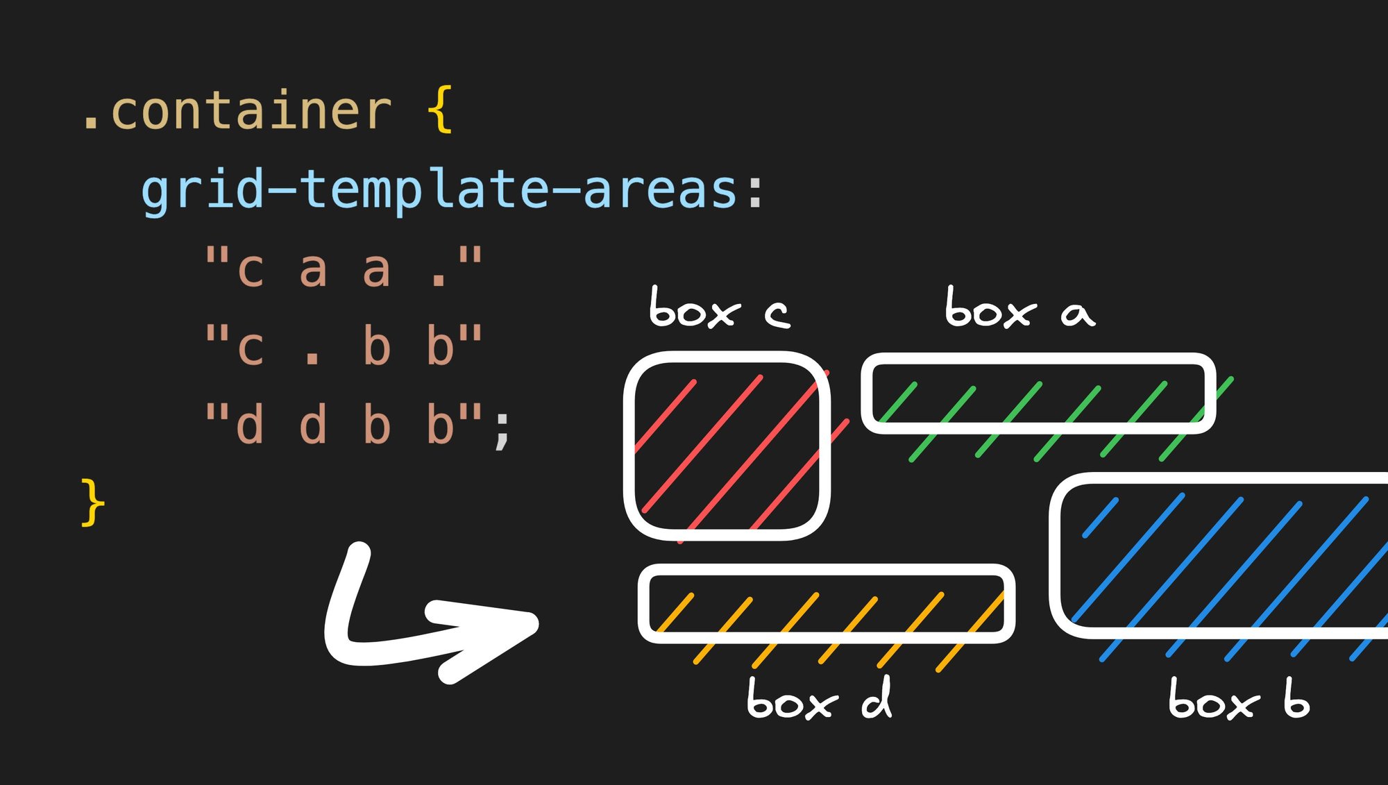
The last feature I want to discuss is stretching grid areas. By writing the same grid area name multiple times to make a rectangle shape, you can stretch an element!
We can combine everything we learnt today to build a complex 3x4 grid with stretched elements and empty cells between them:
See the Pen grid-template-areas - 5 by sami (@samijaber) on CodePen.
Notice that I explicitly set grid-template-columns and grid-template-rows. This is needed because the CSS Grid will otherwise collapse the stretched elements, resulting in fewer rows/columns than we want. We use the repeat(x, 1fr) function to tell CSS that we want x rows (or columns) to split the available free space, fr, equally.
Warning
There are two important things to keep in mind when using grid-template-areas:
- Each row must have the exact same number of cells (add
.to fill in any blanks). - An element can only stretch into a rectangle. This means that this example:
is invalid, because b makes a complex shape that is not a rectangle.
If you don’t respect either of these two rules, your grid will completely break, so watch out!
Wrap up
Isn’t it amazing that, besides setting the grid-area properties, we didn’t have to touch any of the grid children or reorder them? We were able to modify our layout to an extreme degree by modifying the container’s CSS class over and over.
This can be extremely useful when you need to:
- iterate very quickly on a design and test different ideas
- build responsive designs that involve a lot of resizing and reordering between sizes
I hope you are as pleased to have learned this as I am to share it with you. Let me know what you end up building with CSS Grid!
Share