

Web Development
Modern CSS for 2024: Use Cases for :has()


All right, let's get real about the :has() pseudo-class in CSS.
It's kind of a big deal.
Think of :has() as the cool new tool in your CSS kit. It's all about checking if an element has a specific other element inside it. This isn't your everyday selector; it's a bit like having a secret power for your styles.
It's like conditional styling made easy.
But it's more than just looking at parent-child relationships. :has() is versatile. You can get creative with it and explore different ways to apply styles based on various element relationships.
In this post, we’ll explore a few different use cases on when and how you might want to use it.

You can find all the examples in this Codepen collection.
What it is and can you use it
:has() is classified as a level 4 CSS selector and has been implemented in Chrome 105 onwards (Firefox was the last hold out, but shipped it at the end of 2023 in version 121).
In a nutshell, it’s like a lookahead assertion in Regular Expressions.
Its introduction is significant as it allows for relational checks within the CSS, a feature that has been in demand for a considerable period.

With global usage of 90% and it being available in all modern browsers, there’s no reason why you shouldn’t start using it today for your future projects!
Inspiration
I am a fan of Wes Bos and Syntax.fm in general.
Not long ago, he posted this on Twitter (X):

This was just when I was working on my modern CSS for 2024 post. I considered adding a section about the :has() selector, but felt it wouldn’t have done it justice.
Instead, I thought it would be cool to show all the use cases Wes showed in his post with some real-world examples.
Let’s dive into some has:() tips!
Basics
To showcase this section, we’ll be using the following design:

I generated this design by using Builder.io Figma plugin, and then used Visual Copilot to generate the code.
You can find the initial code in this Codepen link.
This is our generated HTML:
And CSS:
Parent has a specific element
One of the easiest use cases is when you want to style a parent element when it has a certain child.
Let’s say we want to style our blog post differently when we have a subtitle. In that case, we’ll change the background color.
This is all the CSS code we’d need to add:
Now if we add an h2 element with the subtitle class in our HTML:
We will get a different color header:

Parent has both elements
How about when we want to style the parent when it has a subtitle and a quote? Pretty straightforward:
Only when both h2 and blockquote will the background color change.
Parent has either or both elements
In case you might want to keep the styles when you have one or both elements:
A parent does not have an element
Using the :not() pseudo-class we can do the opposite and set a style when a child element is not present in the parent:
The anywhere selector
Conditional styling with no JS
It’s possible to use :has() to select almost anything anywhere depending on a condition. In the following example, we’re even triggering a setting with no JS!
Once we check the input the answer class is blurred out.
What the selector is saying is that when the body element has an input with the class of blur-answer inside of it and it’s checked, style the following (any selector can be used).
If you use this method, don’t forget to make sure this is accessible!
Just in case style
Another use case for the “anywhere selector” could be to remove the logo from a nav bar in case the logo already appears in your hero section.
To show this off, I’ve used the generated nav bar from my colleague's post “Active Navlink Transitions with HTML, CSS and JavaScript”, took the logo from there, and generated a hero section that also has the logo.
This is what it looks like:

The initial code is in this Codepen link.
In this case, the logo being duplicated is an eyesore, and your designer is going to throw a fit.
Luckily, we have an easy fix for this!
All we have to do is write a CSS selector that checks if we have a hero section (our .hero-with-logo class) and if that’s the case, hide the nav bar logo:
And now we have our logo only once:

💡 All the code can be found here.
All the code can be found here.
The previous element selector
This is something that was not possible before we had :has().
Let’s have a gander:
We have 5 elements, and on element 3 we’ve put the .select-before class. In our CSS we’re telling the browser to give a background color to any element that has a next-sibling which has the class select-before.
That way, element 2 will get a background color:

Wait a minute for that to sink in…🤯
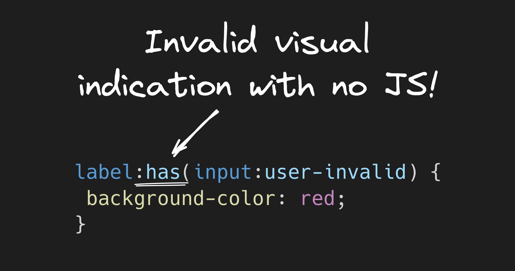
There’s a lot of whacky stuff we can do with this method, however, one that might be useful is highlighting a label of an invalid input:
With those 4 lines of code, we get native HTML validation with conditional styling and no JS!
This is what the experience looks like:
How cool is that?
Layout targeting
Let’s say we use HTML and CSS for creating slide decks. According to the content on the slide, we can switch up the layout of the slide. For example:
For the full code, check out the Codepen.
We’re changing the template areas according to the content.
Granted, this might become cumbersome if you have a lot of layout variations, but still, it’s a nice use case.
Form validation styling
I’ve already shown you one way to do this in the previous sibling selector section, but that is in case a label and an input are siblings.
This is a bit more of a generic approach.
For example, we can style labels inside a form when there’s invalid user input:
Notice that both inputs are required and are nested within the label. This is what indicates to our selector that the label element that has an input in it is invalid.
Now if we don’t type in a password that matches the requirement of 8 characters or we don’t type a valid URL in the Website input, we’ll get an validation for it:
Again, all the UX interaction, none of the JavaScript!
Gotta love it.
We can also use this approach to style a when one of our inputs is invalid:
Check out how this behaves below:
Similarly to the label example, the key part is that the fieldset has the invalid input inside of it, to achieve this.
Style my siblings, but not me
What if you want to style the siblings that we are not hovering?
Check it out:
We’re targeting the card-list class, and checking whether a card is hovered, then selecting the cards we are not hovering.
This one is pretty cool and was not achievable in pure CSS before :has().
Another use case could be hovering over a table row and dimming out the other rows.
Quantity queries
Style in case a parent has X or more children, we can style it differently. For example:
This would result in the following:

Empty children elements
Have you ever had a case where your React component may have rendered an empty child, but you had a hard time noticing?
Try this out:
This can come in handy when debugging.
Has dropdown
In case you have a menu that has a dropdown with nested elements, you can find it and mark it. I’ve found this Codepen of a simple nested CSS-only menu, and all I had to do was add the following:
Now, we know what section can expand:
Match attributes in selectors
Say you have a .png image that has a transparent background, you can find it and add a background color like so:
You can use this method to grab into basically any attribute you can think of and style either the parent or any child of that parent. Feel free to come up with your use cases.
Conclusion
In the grand scheme of web development, the introduction of the :has() pseudo-class is like discovering a new continent on the map of CSS.
It's revolutionary, folks!
This nifty selector isn't just a minor update; it's a game-changer that opens up a world of possibilities for dynamic styling that we could only dream of before.
From styling parents based on their children's attributes to implementing complex layout changes without a single line of JavaScript, :has() brings the kind of power and flexibility that makes both designers and developers do a happy dance.
As we've explored, whether it's styling elements based on their quantity, selecting previous elements, or even handling form validations with a newfound elegance, :has() stands as a testament to the evolving nature of CSS.
It's like having a Swiss Army knife in your CSS toolbox, ready to tackle a myriad of challenges with precision and efficiency.
The introduction of :has() is a reminder of the ever-evolving landscape of web development. It's a call for all of us in the field to stay curious, keep experimenting, and continually push the boundaries of what's possible.
So, embrace the :has() pseudo-class, experiment with its capabilities, and watch as your styling game reaches new heights of creativity and efficiency.
The future of CSS just got a whole lot brighter, and I can't wait to see the innovative ways this community will leverage this powerful tool.
Happy coding, and may your styles be ever dynamic and responsive!
Share